NickShutter
2016
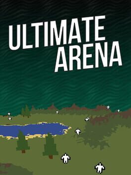
Triverske's Ultimate Arena is a slightly more complex take on BrantSteele's Hunger Games Simulator that lets players drop CPU characters onto a large overhead map in a battle to the death. Players can customize characters' icons and sprites as well as their stats, and characters can also have custom lines of text associated with any given action that shows up in the event feed. Maps can be randomly generated or custom-made. While the AI fights, players can view both 2D and 3D versions of the map, as well as take more direct actions—placing mines or care packages, moving fighters around, killing them off, or even causing causing arena-wide "events" (also customizable). Aside from that, the game mostly plays itself. That's something that can be a little controversial for capital G gamers, but it's a feature I find some games—this included—bringing merit to.
One of the major draws of Ultimate Arena over any of the free web browser takes on this idea is the Steam Workshop. From the screenshots to the trailer, it's clear that the intended way to play is to download a lot of user-made content. You can, after all, put hundreds of these guys on a single map. There's a massive pile of user-made content to browse through, and for a niche game from 2016, it's impressive that it still gets people uploading to the Workshop in 2023. Speaking of 2016, though, much of its official branding and default character database are very of their time. There are plenty of important historical figures in the list, but there's a skew towards then-contemporary topics like the 2016 election candidates... and PewDiePie.
I personally got the most enjoyment out of Ultimate Arena by using it as an excuse to custom-make little pixel dolls of my favorite visual novel characters and watch as they tripped into landmines and bashed each other's heads in with rocks. So as a jumping-off point for being a creative tool, I do enjoy Ultimate Arena, even if I spend more time making the custom content than actually running simulations. Hell, the first thing I did was delete all of the cringy default characters—I haven't even downloaded any from the workshop because I like the game more when the spritework on the 3D map is consistent. I tried downloading maps, but the majority of them are an "older" kind of map file from the game's early history that just doesn't work anymore.
Some elements leave me wanting something a little more complex and cleaner around the edges, though. For example, CPUs largely appear to ignore terrain height—the only "real" thing about the map—and can scale sheer walls. Characters have various needs that they need to maintain, like hunger or thirst. These are replenished when they hunt, but it would be nice if maps could be customized to make specific spots more or less amenable to fixing up various needs, which would make character movement more interesting than mostly "wandering towards the center" (unfortunately the map editor never made it out of beta). Another need is "sanity," which slowly depletes but doesn't seem to be tied to any of the stats a player can set on their character. The character creator itself has a few bugs associated with it—sprites need re-added every time an adjustment is made, or else an extra set of the outermost pixels of the sprite are applied around the edges. Characters are unable to have different left-facing and right-facing sprites. Character names are limited by the length of the input box and editor access is forbidden while fullscreen. Characters can have they/them pronouns but due to the uniform way scripting is handled between genders, you get awkward phrasings like "they is" and "they has." It's a lot of little nitpicks (and for what it's worth, the game's source code is available to those who purchase so I could theoretically fix it myself if I was a brain-genius), but it does make me wish that this microgenre of "Hunger Games simulators" took off just a little bit more, or lasted just a little bit longer. Maybe in the future, we'll get something a bit more fully-fledged from people who grew up on these and remember them fondly. For now, though, I can appreciate Ultimate Arena on its own merits.
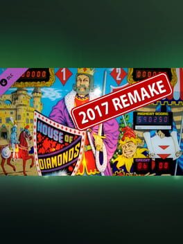
Not the worst table in the Zaccaria collection, but a brutal and frustrating one not helped by the developer's choice to set the Wizard Score challenge to 1.5M. The primary goal of the table is to knock down the ten numbered targets in the top half three times, enabling the flashing red special—acquired by then striking the moving target in the center. However, this barely nets any points compared to striking the bonus multiplier targets on the left and sending the ball around laps (mostly right to left) for extra credits. Once the achievements for targets, bumpers, and the red special are acquired, the top half of the table falls out of favor entirely.
Additionally, the table loves sending the ball right down the center. A magnet hole on the right will shoot the ball towards the center at a random velocity, often picking the space between the flippers. The magnet hole can't be avoided entirely, though—it's where extra credits are earned once the ball has done enough laps. That's right, the thing that grants you extra balls loves to take them, too. The center target and outer track love doing this on occasion as well. And because it's a table from the '70s, there's no ball saver at start. It all adds up to a table that feels incredibly unbalanced and more luck-driven than skill-based.
Additionally, the table loves sending the ball right down the center. A magnet hole on the right will shoot the ball towards the center at a random velocity, often picking the space between the flippers. The magnet hole can't be avoided entirely, though—it's where extra credits are earned once the ball has done enough laps. That's right, the thing that grants you extra balls loves to take them, too. The center target and outer track love doing this on occasion as well. And because it's a table from the '70s, there's no ball saver at start. It all adds up to a table that feels incredibly unbalanced and more luck-driven than skill-based.
2019
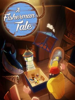
A Fisherman's Tale is cute. It has some fun little visual tricks, it looks nice, and the puzzles are okay if a little repetitive in their solutions. My fun was kind of spoiled, though—even though I turned hints off in the settings, dialog would constantly tell me exactly what to do instead of letting me solve the puzzles at my own pace. Voice lines would also repeat way too frequently, grating on my nerves. I also found the final puzzle of the game to be particularly janky in comparison to the others.
It's an excuse to play Gen 1 Pokémon again—one of my favorites to play—but with a little extra challenge. All Pokémon are stuck at level 5, which means they can't evolve or learn new moves. It seems like a fun idea, but a few small oversights on the part of the hack developer allow players to break the game—most importantly, the Hitmonchan and Hitmonlee in Saffron that you can acquire are level 30. You'll also be faced off against an overlooked Raticate right before Vermilion, and Brock's high defense Pokémon were enough of an early-game wall that I decided to perform a Brock skip rather than face him as intended. I left this one unfinished, but a few fixes could make this challenge more "enforced"—nerfed Hitmons and a few glitch-preventing boulders would do the trick.
Brutal outlanes with kickbacks that love to send the ball into the other kickback, down the middle, or sometimes right back into themselves. Unconvincing "card shuffle" sounds and an annoying voiceover appears to be done by an unenthusiastic intern. Bad vibes on this table, definitely one of my least favorite Zaccaria "remake" tables.
[Valve Index]
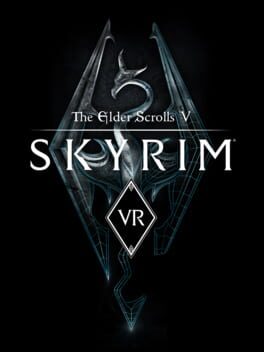
Pretty much any game developer can tell you that making a title for virtual reality isn't as simple as "hitting the VR button." A lot of work goes into making a VR title—especially one worth actually playing. That makes it all the more annoying that it really does feel like Bethesda just hit the "make it VR" button when porting The Elder Scrolls V: Skyrim Special Edition to VR. Aside from half-baked hand tracking and a custom starting area, very little care was put into making Skyrim an interesting VR game. While it's neat to explore Tamriel in a more immersive way, the game lacks the physicality that VR promises. There's very little in the way of physics interactions—your hands barely interact with the environment, either phasing through people and items or sending them flying erratically. Without collision, melee combat feels like whiffing at the air. Congratulations, you're playing Skyrim again, but this time, you're doing it standing up. To add insult to injury, players are expected to purchase this rush-job separately from the desktop version of Special Edition—which I still don't even own. If they were going to put so little effort into it, it should have been a free update to Special Edition and not a full-price standalone purchase.
As my score suggests, however, not all is lost. I had quite a good time playing Skyrim in virtual reality, but that's despite Bethesda—not thanks to them. If you're willing to spend half a day modding the game and learning how to correctly apply confusing shit like DynDOLOD, Skyrim VR is more than just a salvageable experience—it's one worth getting into. The Elder Scrolls fan community has done an amazing job of making this port worth playing. With a handy guide and a bit of patience on the player's part, it's possible to make the world of Tamriel a beautiful, jaw-dropping experience worth exploring for the visuals alone. The combat and gameplay... well, it's still Skyrim. That said, I feel like the notoriously same-y combat is made a bit more interesting when the swings of your sword, the drawing of your bow, and the casting of your spells are done with your own hands' movements. There's an additional layer of immersion there that makes the combat feel more worthwhile than the one-button-mashing of the desktop version. If you have a headset, an attachment to Skyrim, and some time to burn, I think it's worth trying out the game after modding it. Just... don't buy it. Bethesda could do without the encouragement.
2022
[Valve Index]
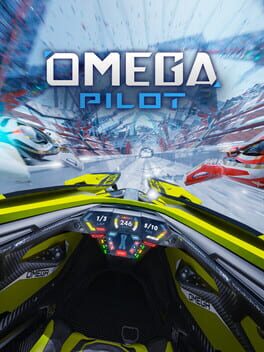
With the game out of early access, I'm mostly happy with the end result despite a few gripes. It's a strong overall experience with speedy racing and a unique control scheme—one that takes some time to get used to but leaves an impression for those willing to learn it. Graphically, there's a good balance between realism and stylization, which leads to a good level of immersion inside the cockpit. Issues with controller tracking have been fixed and the UI has been touched up quite a bit since the launch of early access. The asynchronous multiplayer does a good job of adjusting selected opponents to match your skill level, though it may take a few plays on each track for it to find where you're at.
The race tracks, though covering a good range of futuristic styles visually, unfortunately get somewhat repetitive. Flying the vehicles in slightly more open tracks feels great and natural, but a lot of them are tight corridor-type tracks requiring high levels of precision. While a few of these would be welcome, they are the overwhelming majority and overshadow the other kinds. This results in a high difficulty spike early on, as well as struggles with particular tracks where it's easy to constantly run into walls or get stuck on geometry that sticks out. Though the inclusion of a few unique track types, like slalom, is welcome, it would have been nice to see tracks with broader lanes, point-to-point tracks, or even tracks with unique hazards.
Despite the nitpicks, it's a neat enough experience that it's certainly worth looking into.
2021

Hellhole is a very short Donut County clone with none of Donut County's charm. The game uses the "Hellhole" players send objects into as a metaphor for the way humans treat the world as disposable, tying in an environmentalist message to the whole experience, but it does so awkwardly—a portrait of a woman who ages more and more with every appearance pops up in-between levels to scorn humanity for its inconsiderate ways, starting with the very first people to settle down and start farming. Despite tying into the gameplay aspect of burning stuff, the climate change approach is handled poorly, leaving behind an aftertaste of nihilistic doomerism and anarcho-primitivism. Combined with the stubborn and janky physics of the hole and objects it's supposed to consume, Hellhole ends up being a joyless experience.
[Review for iOS]
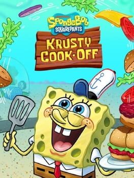
The game itself is pretty simple—multiple customers approach your station and order at once, making you juggle between cooking and prep stages. Don't let food burn while it's cooking, prep the food right and serve it fast so you can free up prep spaces. If you take too much time, your customers will be upset and leave. You earn gold during these runs, which you can spend on upgrading your station and restaurant. If you've ever played a game in the Cook, Serve, Delicious! series, this will sound familiar. If you've ever gotten halfway through a CSD game, it will feel mindless to play, offering very little in challenge or substance. It might work for its young target audience, but if I were a parent, I don't think I'd let my kid play this.
I'm not familiar with the usual advertisement standards when it comes to mobile games for kids, so when I downloaded Krusty Cook-Off, I had hoped that its ads and other mobile-oriented horrors would be toned down. I understand that app publishers have a tendency to prey on kids with unrestricted smartphone access, but I did expect something better from a Nickelodeon-branded product. You can pay for premium currency through the app to spend in-game, and that much I expected, but you can also watch ads and complete "tasks" for them as well. The ads range from mostly normal to extremely questionable—including casino games that advertise the ability to put money straight into (or take it straight out of) your PayPal account. Of course, every ad is the kind that takes you straight to the download page the first time you try to tap the X to close it. The tasks are even more sinister—the ones that net you the most gems require you to sign up to questionable "sweepstakes" by entering personal information such as e-mail accounts and phone numbers. In a game marketed directly towards younger children, and coming from a brand that parents should find more trustworthy, it's incredibly off-putting... almost as off-putting as the disgusting cutscene character animations.
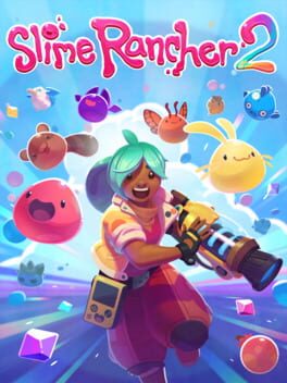
2022
[Quick review for early access launch version]
Though it's too early to pass judgement on Slime Rancher 2 as a complete experience, the launch of the game offers players a pretty solid idea of expectations going forward. We have the heart and soul of Slime Rancher 2 in front of us, and eight hours of gameplay later, despite being pretty much what I expected, I can't help but feel a bit underwhelmed.
The core gameplay of the first Slime Rancher hasn't been tampered with much—feed slimes to get plorts, sell plorts to get money, use money to expand the farm. You also make hybrid slimes to save on space, and explore the world by platforming to areas possibly intended for later in the game (something I genuinely love about the first game). There aren't any big new mechanics, but a few things have been expanded upon or streamlined. For example, upgrades now also cost plorts and resources on top of money, a wise decision that keeps players from gathering upgrades too fast. Players no longer have to place resource extractors down—they're harvested from specific locations once a certain vac upgrade is acquired. There are also a few more slimes and foods now, with more to come, though that's fully expected. I very much appreciate the presence of bat slimes.
Now, these updates to the game are all fine and dandy, but none of them feel particularly substantial. Nothing here screams "Slime Rancher 2!" so much as they do "Slime Rancher 1.5!" Instead of getting the impression that this is a grand new adventure, I'm left feeling like I'm playing the first game but with a big graphical overhaul. The visuals are nice, and I'm especially fond of the new art direction, but I feel like it was given special priority over updates to the core gameplay experience. Slime Rancher 2 plays it very, very safe. The benefit to this is that Slime Rancher 1 is a very, very good game—so on its own, Slime Rancher 2 has the beginnings of one as well. But when I played Slime Rancher 1—even in its early access state—everything was new, and everything was a surprise. Slime Rancher 2, with its copied homework, has yet to offer that.
Tried playing this, but it crashed on Day 4 every time I tried talking to someone or going into the building during the adventure game segment. Hoping to bypass the problem by simply skipping past the adventure game segment, I instead got softlocked in Jenny's mind palace. She wouldn't leave the castle, saying that she must be forgetting something. After interacting with everything in the room, I thought maybe I was supposed to summon Mother here. There was literally nothing else to do, but had no I MP for it—the spell costs all of Jenny's MP and I had tried it on an earlier day just to see what it did. The game doesn't provide a way to recover it, or if it did, there wasn't a way to do so in the room I was trapped in. With nothing but a hunch and what little remaining patience I had remaining, I fully restarted... only to suffer a crash on a Day 2 random event—being dropped into a purple maze.
I'm not sure if the "real world father is a drunken abuser" real life segments and the "spooky blood and static and meat horror" dream segments ever come together to form something actually cohesive, or if the latter is just a quick way to symbolize the character's turbulent emotional state, but I'll probably never figure that out. A few people seem to really like She Who Fights Monsters, so I was looking forward to it, but the game is unfortunately broken to the extent that I can't muster up the patience for it.
I'm not sure if the "real world father is a drunken abuser" real life segments and the "spooky blood and static and meat horror" dream segments ever come together to form something actually cohesive, or if the latter is just a quick way to symbolize the character's turbulent emotional state, but I'll probably never figure that out. A few people seem to really like She Who Fights Monsters, so I was looking forward to it, but the game is unfortunately broken to the extent that I can't muster up the patience for it.
TBD
Of all the gay furry visual novels to come from the post-Blackgate, post-Echo, post-Adastra explosion, the currently in-dev Nerus is by far the most unique and intriguing. At first glance, the visual novel is pretty unassuming—one might even say unappealing and visually crude. Its sprites and teaser material do indeed lack the visual polish of some of its popular contemporaries, but this is a flaw that I found easy to overlook once I settled into its writing.
To describe what Nerus is about without oversimplifying to the point of uselessness is a difficult task. It's easy to say that Nerus is about two powerful beings whose supposed immortality proves to not be enough to fight against the social and physical barriers that keep them away from each other. At its core, this is the case, but Nerus is a visual novel with many moving parts. It has a large cast, with some characters and side-plots appearing entirely disconnected from the main story for significant amounts of time. Many of these characters' backgrounds are explored in-depth, and many get their turn to be the narrator, offering readers a look into their views and thought processes. The plots all take place over long periods of time, and readers are expected to remember a significant number of events and details. Nerus is intricate, but it's also a slow burn. I was certain I was reading for several hours when I saw the on-screen text notifying me that I had finished with just the prologue.
With this many pieces at play, Nerus is tasked with the burden of now sticking the landing. It's not always easy to put faith in an in-development work, and Nerus has a lot of work to do to justify its grandiose narrative decisions. That said—with its likeable cast, solid prose, and multiple engaging storylines, I haven't been given a reason to believe it won't remain a satisfying experience in its future updates.
[EDIT: There's an English version now, so this is outdated.]
Kaikikai no Yume is a Yume Nikki fan game by multimedia artist mixel. Like many Japanese YNFGs, it remains untranslated—it's a newer one, after all. That's usually not an issue for us English-only players, though, given how limited the text tends to be in these. Kaikikai no Yume is an exception here. Of all the YNFGs I've played, this one is the most dialogue-dense by far, easily surpassing Motel Snooze in that regard. I think that's really cool, and love to see unique takes on the YNFG formula, but it does make it hard to play when you don't know Japanese—especially once puzzles get involved. Kaikikai no Yume isn't just dialogue-heavy, it's also puzzle-heavy, a feature that elevates the language barrier.
So I didn't get to play as much as I'd have liked, but I can say for sure that it's worth looking into—especially if you can read Japanese. It's obvious from a glance that Kaikikai no Yume is Yume Nikki-inspired, but the actual art style is very uniquely mixel's. A mash of glitchy digital art, pixel illustrations, and photomanipulation give the game a strong surrealist and abstract bend, even in its most grounded moments. While I would have liked to explore more of its world, it didn't take long for me to start feeling like I was only getting half of the experience. If you think that barrier will be less of an issue for you, and you want a visually distinct YNFG, absolutely give this one a look.
2020

If—like me—you're trying to make a Living Dex, this is the way to store all of your Pokémon in one place. Besides that, I'm unsure of why anyone would deposit their little guys in here. In theory, it's cool to have a space to store all of your Pokémon across every generation (1–7 on a 3DS with Pokémon Bank and the rest on Switch), especially since that hasn't always been the case. Without the guarantee that players will be able to bring those Pokémon into future games, though, Pokémon JAIL feels like a more apt title.
To rub salt in the wound, it's a pretty flimsy subscription service without much to it. PNGs instead of models for the Pokémon, limited information when it could have been more encyclopedic (like a Pokédex), and nothing to do on the side like breeding, EV training, Poké Pelago, etc... not that they really promised anything like that, but HOME feels like soulless software that could have been much more interesting.
To rub salt in the wound, it's a pretty flimsy subscription service without much to it. PNGs instead of models for the Pokémon, limited information when it could have been more encyclopedic (like a Pokédex), and nothing to do on the side like breeding, EV training, Poké Pelago, etc... not that they really promised anything like that, but HOME feels like soulless software that could have been much more interesting.
1992
(Review for SNES version.)
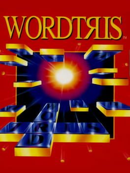
It's time to bully a 1992 video game that no one cares about.
Wordtris isn't particularly popular, and as early as the main menu, it's not hard to see why. If ever a game could be described as "sickly," that game would be Wordtris on the SNES. I briefly touched on its aesthetic qualities in my 2018 review of its soundtrack (yes, really), and it's worth bringing it all up again because of how strongly its audiovisual design impacts the feel of the game—arguably much more than its actual gameplay.
Wordtris makes the strange choice of utilizing heavily compressed and posterized circus photographs, their strongly saturated colors clashing with the drab letter blocks and wooden playing field. It's just got this really unappealing visual style that the gameplay concept isn't even dependent on, so it almost feels like an insult to what the SNES is capable of. Even if the developers were really married to this whole circus theme they ended up going with, they could have at least utilized brighter and more colorful pixel art instead of this weird dirt-with-ketchup-on-it visual style they've got going on here.
The sensory assault doesn't stop with its looks, though—its soundtrack deserves some spotlight as well. Long story short, Paul Mogg composed some circus-y tunes for the game on a Macintosh program, and then audio engineer David Warhol ran it through a sound driver to convert the MIDI files for the SNES's 16-bit audio processing unit. I don't know whose fault it was—whether it was an issue with the composition or the conversion—but the end results? A weird, anxious, and repetitive score that underlines the dingy, skeevy feel of the final product.
And you know what? I think it... kinda works? It's got this uneasy, surrealist tinge to it—probably unintentional—but there's also something instantly nostalgic about it for me. It was something I felt on my first playthrough, despite never playing the game as a child. Though I sorta grew up with access to a SNES, it's not a vibe I get from most SNES games I come across. That said, I can definitely understand why most people don't vibe with it, regardless of the gameplay. It's pretty a grody game—but I think it's neat regardless.
I can boot up Wordtris if I need to burn a few minutes, and I actually enjoy myself. I really do like the gameplay, and I think there are a few design elements in there that are pretty smart. Letter blocks fall down a grid and collect at the middle instead of the bottom—this is so, at least initially, stacking blocks will push the whole stack down further instead of building upwards. Once you've stacked enough in one column that the letters are touching the bottom, that's when they'll start building to the top. It makes it easier to actually make words to clear the blocks, and allows players to intentionally push letters down to make words with otherwise unreachable blocks. It could have just been a Tetris grid with letter blocks, and it would have sucked a whole lot. Some thought really went into making this a solid gameplay concept, which is appreciated.
I have no closing paragraph, go home. End of review.