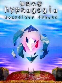
Dev seems active in the discussion forums so I'll refrain from completely dumping on it, but several things bug me about it, some small some not so.
After playing the demo, I decided to grab this when it went on sale and finally got around to playing it. Immediately I notice there's this weird, tacky sprint/run/jump indicator that I swear wasn't there in the demo... Which, to be fair, I thought there was 0 indicator for sprinting in the demo (no speed lines, no fov increase, no hastened sounds, etc; you just move a little faster) Also don't remember the chromatic aberration being THIS intense either, it's kind of dizzying and similarly distracting; forced CA is awful and a genuine accessibility issue, I generally side on "muh artistic intent" but I will pretty much never make that exception for CA. Also inexplicably can't use dpad to navigate in this, can't rebind anything and can't adjust music volume separately short of completely toggling it on or off.
On the more nitpicky side of things the mixed use of both proper spritework and generic materials weirds me out, the first level has its own drawn texture for water but the second level uses this weird, high res mesh for it that clashes with the rest of the artwork. It feels like the manifestation of those Tumblr blogs from 2012-2016 that would repost that one screenshot of a neon-adorned Windows 98 style desktop with custom icons for emulators (which also peeved me at the time because I've never been a fan of faux-nostalgia, like having two different icons for "GameCube" and "Wii" even though for as long as Wii emulation has been a thing, it's combined with GameCube via Dolphin.)
Oh, but you can pet the dog. This is so poggers wholesome 100, +1 star and my criticism is obviously invalid now as I'll be skinned alive by the sweet wholesome crowd for their candy gore mural.
