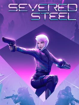
There's not a ton of complexity as to how Severed Steel operates and some elements need fine-tuning, but I can't help but appreciate how much the game accomplishes with surprisingly little. I'm a fan of the simple and effective UI; your aiming reticle is surrounded by two bars that convey how much ammo and slo-mo time is left (so these gauges are always near the center of attention) and the flashing light on your gun also changes color (from light neon colors to yellow to red) so you're constantly keyed in on when you'll need to pick up a gun early or engage/disengage when running low on supplies. Enemies stand out from the environment thanks to the cel-shaded enemy outlines, and upon death emit a distinct explosion sound-effect so there's no ambiguity when quickly rifling through targets during firefights or when picking off enemies from afar. Guns feel great to aim and fire in slow-mo, mainly because there's very noticeable recoil when firing in real-time; the contrast really helps sell the necessity of the feature. I also love Severed Steel's kick as both a form of attack and traversal; the obvious purpose is your primary melee attack while holding a gun if you don't want to expend your limited magazine to finish off an enemy as well as kicking open doors, but it can also be used to quickly ascend up walls or kick off of grounded/aerial enemies if your double jump isn't enough. The same goes for the arm cannon; you can fire holes into any surface if you don't feel like hunting down stairs/doorways for objectives, but it also provides a nice desperation option to instantly eliminate shielded enemies or drop heavy grunts down to another floor if you find yourself without a weapon.
Despite the appealing core gameplay, Severed Steel can often feel a bit repetitive. Enemy variety feels lacking since the player is usually approaching enemies in a similar manner (that is, entering slo-mo while using stunts to efficiently dispatch foes while firing into their heads/backsides), and I would have liked to see enemies that had to be specifically eliminated using the arm cannon or melee as mix-ups. The Rogue Steel mode does touch upon this with random enemy buffs that force such approaches, but at times I feel like this mode prefers to lengthen combat by overwhelming the player with excess enemies with more health. I do think the game could have also leaned a bit more into its parkour elements with additional stages that focused upon traversal and dodging/quickly disposing of enemies, as there were only a couple of timed story missions that necessitated a rush to the end. Finally, I have to agree with HotPocketHPE that the slo-mo gauge is unbalanced; you'll practically never run out of bullet time as long as you're staying in stunt mode (super easy since there are floors and walls aplenty to slide and wallrun), though this is again addressed from playing Rogue Steel via the "Rebalanced Bullet-Time" unlockable modifier. Even with these gripes however, Severed Steel is a pretty easy recommendation considering how content-rich the game is from its many different modes and extra campaign/workshop levels to tinker with. It was an absolute steal at 80% off on the Steam Spring Sale, and I can't wait to see how Greylock Studio iterates and improves upon their already fantastic formula.
Despite the appealing core gameplay, Severed Steel can often feel a bit repetitive. Enemy variety feels lacking since the player is usually approaching enemies in a similar manner (that is, entering slo-mo while using stunts to efficiently dispatch foes while firing into their heads/backsides), and I would have liked to see enemies that had to be specifically eliminated using the arm cannon or melee as mix-ups. The Rogue Steel mode does touch upon this with random enemy buffs that force such approaches, but at times I feel like this mode prefers to lengthen combat by overwhelming the player with excess enemies with more health. I do think the game could have also leaned a bit more into its parkour elements with additional stages that focused upon traversal and dodging/quickly disposing of enemies, as there were only a couple of timed story missions that necessitated a rush to the end. Finally, I have to agree with HotPocketHPE that the slo-mo gauge is unbalanced; you'll practically never run out of bullet time as long as you're staying in stunt mode (super easy since there are floors and walls aplenty to slide and wallrun), though this is again addressed from playing Rogue Steel via the "Rebalanced Bullet-Time" unlockable modifier. Even with these gripes however, Severed Steel is a pretty easy recommendation considering how content-rich the game is from its many different modes and extra campaign/workshop levels to tinker with. It was an absolute steal at 80% off on the Steam Spring Sale, and I can't wait to see how Greylock Studio iterates and improves upon their already fantastic formula.
5 Comments
@HylianBran I think you basically described why this game's UI impressed me so much; it really stands out with the clean display that's always presenting exactly what you need in visible view while there's tons of flashing lights and explosions all around you. It's probably a big reason why I'm so drawn to Team ICO titles as well; minimizing the amount of "gamey" elements plastered on the screen both helps the player focus more on the world around them and alleviates sensory/information overload during stressful situations. I always find it really interesting how games try to convey necessary information without just adding another bar to the UI, although like you said turning the screen all red when you're low on health can get obnoxious very quickly (which unfortunately Severed Steel does do, one of the few downfalls regarding its UX). Still, I'm inclined to agree with you that games just need to stick to the basics when figuring out a clean and consistent UI and less tends to be more in a world where games love to waggle how many new features they've got on display.
@Drax actually, the ui is probably my biggest problem with shadow of the colossus. I really don't like that the completely awe-inspiring bosses have this in the corner and it sticks out since it's not there when riding the horse. The grip meter probably couldn't be reworked but I'm sure that the boss life bar could. I also don't think that wander really needs a life bar at all. You have to take such massive amounts of damage to die that it's either an instant kill (like falling down a pit) or it's something that could easily be communicated with a change in his posture. Also the grip gauge getting bigger as the game went on looks really amateurish.
One UI thing that really grinds me gears is notification pop ups because video games are for mass consumption. Grandma won't figure out that getting hit will make the life bar go down in god of war so it has to say that at the top left. Yes, I swear that's in the game it's completely pathetic. A mature-rated game for manly man men doesn't trust you to notice the bar going down when you get hit. That's especially egregious but games are full of this crap now. I mentioned Batman Arkham City and that game demonstrates one of my biggest UI pet peeves and that's the weird compass thing at the top of the screen that games have now. It like acts as a compass but there's also waypoint markers on it and it looks like crap and is also really confusing. I'm totally fine with games letting you set waypoint markers but so many games from the last 15 years or so will set them in the map automatically which drives me nuts. If you say "go to edna's diner," I would much rather either look for it on the map or heaven forbid use my brain to decipher where it is based on what characters tell me or context clues or something. That's bad enough but then games put this stupid compass on there and it both looks dumb but it also confuses me. I swear when I first played this game I didn't know what the fuck I was looking at. A minimap would be better. What would be BEST is if I can push a button to remove the map if I don't want to see it. Yakuza 2 is a really beautiful game so I almost always have the map closed but that would get totally ruined if I had to have the stupid dumb map on screen.
Also this is kind of unrelated, it's not a UI thing but it is a UX thing. And that's the fucking CLOSE TO DEATH BEEP. This shit is so much worse than some dumb red thing on the side of the screen. It does NOT STOP until you restore your life and that's not always possible. Those super close boss fights where you're at 1hp and unfocus your eyes and just barely kill the boss... they're good, right? Imagine those but with BEEP BEEP BEEP BEEP the whole time. That shit is dumb!!! I hate it. Is one beep when you get to that state not enough? Yes, my life bar is flashing, I know I am at low health. Who wants this shit? That's all my complaining these are first world problems
@HylianBran You're not the first to bring this up but yeah, I agree in retrospect after playing The Last Guardian. The sigils glowing on and off + the sword showing the relative positions of the sigils should have been sufficient indicators to the colossi's health, and Wander changing his posture/movement speed similar to how it's done in Last Guardian (the boy limps once he's taken sufficient fall damage) would have eliminated the need for a health bar. Maybe the grip gauge could have been communicated silently from increasing controller vibrations or Wander breathing more heavily or starting to slip in a special animation? That one's harder to say.
I do think that streamlining games to where the player is almost dependent upon the minimap in the corner of the screen (or just producing an arrow with a distance of how far you are from your intended target) does distract from free-flowing exploration of the world around you, so I also agree there. At the very least, it would be nice if there were an option to toggle waypoints/minimaps on and off. Either way, minimaps and waypoints seem to be used to distract players from just exploring the world at their whim and not creating notable/distinct landmarks and geological features to guide players, and that's a shame considering these two categories are definitely not mutually exclusive.
Don't worry, I do understand most of the things you're complaining about here. I've played more than enough Pokemon games to share your pain regarding the "low health beep." Gen 5 turning the low health beep into the backing beat of its own distinct warning music really did it wonders regarding its UX. Wish more games in the past did this.
ha, I forgot he did a shadow of the colossus review. I think that a rumble implementation for the grip gauge would be cool but I'm not sure if its enough to replace the icon. Obviously this couldn't be easily added to shadow of the colossus but I think that a combination of the hd rumble stuff and putting the grip button on one of the ps5 haptic triggers could be interesting. I don't get why both nintendo and sony invested in haptics when it feels like they're barely using them but I digress
HylianBran
1 month ago