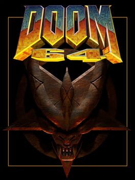
Super mixed feelings on Doom 64. On one hand, I love the murky, muddy aesthetic and the spookier atmosphere, but I don't think it matches with classic Doom gameplay and the level design is a massive downgrade.
Compared to Doom I and II, 64 is a much gloomier game. Gone are the rip-roaring synthesised guitars and vibrant designs of red, yellow and white levels- in their place are grinding atmospheric tracks and deep greens, purples, greys and browns. I actually really like this change, it makes 64 feel distinct from its predecessors and makes it feel almost like a transitory game between the confident bloodbaths before and the grimy horror of Doom 3- but the gameplay is still the same as 1 and 2, which feels like a bit of a mismatch to me.
Doom 3's commitment to horror aesthetics is paired with much slower, tenser gameplay that lets both pop more, complimenting each other. In contrast, 64's gunplay is the same lightning-fast ballet of bullets that preceded it, but its aesthetics don't quite match. The dim lighting and the rumbling, eerie soundtrack are disconnected from the frantic killing sprees you've been accustomed to and I think if they went all the way in one direction it would have been good- as it stands, 64 is tonally confused.
The level design has also taken a massive hit. Levels are significantly longer than in previous games and loop back in labyrinthian fashion frequently. Now, Doom is no stranger to levels winding in on themselves, but it was mixed with shorter, more linear levels that had more action- compared to 1 and 2, 64 has much more wandering about looking for the next leg of the level, which is a real bummer. If you know where you're going in Dooms 1 & 2 you can wrap a level up in a few minutes, tops. Not in 64.
I really appreciate Doom 64 not wanting to be cookie-cutter in its aesthetics, but I think its level design falls flat compared to its legendary predecessors. Still alright, though.
