SenkaiKasa
2024

supyopyopyon!
behold this simplistic masterpiece.
(pls buy game and support sunsoft i need waku waku 7 2)
behold this simplistic masterpiece.
(pls buy game and support sunsoft i need waku waku 7 2)
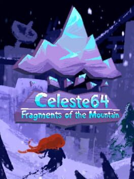
THEY MADE HER GAY CELESTE IS GOOD NOW
2023

love of my life, forever and always~
2023

as humans we are often attached to objects and things. we conjure ideas in relation to what we feel about them and when we forget about them they die out. the loss of an object can be a harrowing experience when you've become affectionate of it.
in the modern age, we are often sold meaning instead of creating it ourselves. the plush toy market engineers ideas of love that exist only for people to buy. our affection is generated through the fear of not having the advertised product. companies have created a reverse loss where the fear of missing out is the same as losing something dear.
quest for moomoo asks us to reject material loss. our lives are much better when we live for art and creation outside of a profit margin. capitalism is a pit of suffering and we can only break free if we remove the immortality of the ideas it has implanted
2022

this is utterly grim, nvidia rtx remix is to gaming what ai generated images are to art. the aesthetic of portal is completely neutered in favor of smudgy hi-res textures and overblown lighting.
not to mention that the new visuals actively detriment the original game's visual guiding and design!!! i've replayed this game a ton and i actually couldn't tell where to go sometimes because the visual clutter introduced by raytracing was so awful.
how excellent that nvidia has blessed us with the ability to make games look like unreal engine nintendo hire this man type shit.
2021

free yuji naka
1998

"sonic had a rough transition to 3D" sorry but this is literally the greatest 3D platformer of all time imo
the sa1 vibe is immaculate
the sa1 vibe is immaculate
2009
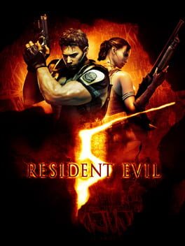
if resident evil 4 was a bold new vision for the future of game design, resident evil 5 is the cold reality of game execs pushing the complete global saturation of boring cover shooter mechanics.
at its core re5 is literally beat for beat the same as re4, but the tedium of its boss fights and level design just utterly annihilates the enjoyability of the gameplay. a lot of the levels here feel the same, just with an african setting and the mexico filter™. they fail at being on the same level of design as re4's frantic arenas and the linearity of many of the fights is incredibly disappointing. plus, you can tell when an area in this game is designed to be played in mercenaries mode lol.
the jill boss fight is one of the absolute worst experiences i've had in a game; it's clunky, the solution is clear but unattainable in a logical way and you have to wait around for 7 minutes if you exit out for whatever reason. every other boss fight and puzzle in this game carries this tedium and lack of polish as well, if you can even call them puzzles.
if that all wasn't enough, the setting is horribly appropriative of african culture. turning the villagers into tribal zombies feels so wrong on every level, there's absolutely no care put into treating the culture with respect. the game even starts with chris talking to a stereotypical arabian guy with a russian accent (why???).
the only part of this game that feels redeemable in any way is the pure cheese of it all. the variety of wresting moves the characters pull off on enemies and the joy that wesker's characterization brings me is immeasurable. i fucking love his matrix-esque dodges and exposition, it's so gorgeously camp. fuck d. c. douglas though, the dead by daylight actor plays this wesker way better. also by the 3rd half of the game, enemies won't be stunned enough to pull off any roundhouses or suplexes, it's so sad.
obviously this is best played co-op to laugh at its quirkiness, but please don't expect a great time at all
1986
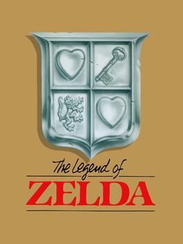
There's an incredibly fun groundwork to the original Zelda's mechanics. The combat's focus on position and blocking feels engaging, though it is incredibly challenging. The various items are useful and pretty quirky sometimes. It's funny to imagine Link carrying a bridge around the whole time. The game's visual aesthetic is also kinda utilitarian with some fantasy stylization to it, the color signifier for enemy difficulty is pretty cool since it applies to Link's armor as well, giving some nice consistency to the world.
That being said, The Legend of Zelda is a game I wish I could play blind, allowing myself to explore. Yet I find myself dissatisfied with the obscure nature of its progression and secrets. The openness of this game is greatly beloved (especially in the advent of BOTW) but there's little in the way of design to actually telegraph the things the game expects you to do. A lot of my time with the game was just regret that I had to check a guide to progress.
It's hard to justify critique on a game like this given its historical context, and it is definitely revolutionary for its time, but I think the first Zelda game just does not appeal to me in the way that its successors do.
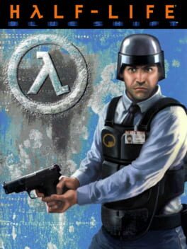
slightly better writing than opposing force but there is literally nothing new here in terms of gameplay. the levels are rather confusingly designed which makes playing this very frustrating. seeing gordon is neat but ultimately just meaningless fanservice. probably avoid playing this
2020
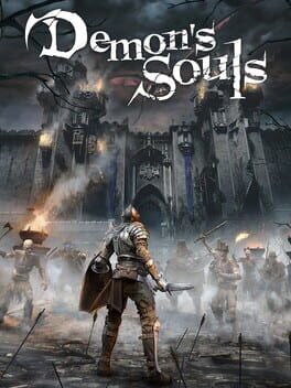
Demon's Souls (PS5) is quite possibly the worst example of a remake ever. Bluepoint have completely misunderstood the complex emotions, atmosphere and vibe that makes the original such an incredible piece of art.
To understand why Demon’s Souls (PS5) fails as a remake, we need to look at the contexts in which we view souls games. The prevailing discussion around the soulsborne series categorises their sole existence as games that gamers play to show how good they are at games. This culture pushes away the capacity of discussion around the artistic merits of each individual game and instead pushes people to view the games on an entirely mechanical level. Because of this, the original Demon’s Souls is viewed entirely as a proto-souls, where its merits as a work of art are discarded because the only significance it has as a game is that it created the mechanical basis for “better” games.
While I plan to write another essay on why Demon’s Souls (PS3) is one of my favourite artistic statements in gaming later on, I'll summarise here what makes the original so special. Demon's Souls at its core is a game about human greed and power. We arrive into Boletaria after the main events of its downfall have already occurred and are effectively set to roam around the wastes, picking up clues of what happened along the way. To many Souls fans, the lorebuilding may feel comparatively tame in Demon’s Souls but I personally feel it works to its benefit, as the game expects the player to come to their own terms on what led to Boletaria's destruction. Demon's Souls (PS3) uses full advantage of the graphical standards and techniques of the seventh generation to create a dense atmosphere that feels in line with the circumstances of its world. Boletaria is shrouded by deep fog because the demons are killing the inhabitants of Boletaria to harvest their souls to be consumed by an entity named the old one. The old one was awoken by king allant while his kingdom was in prosperity because he felt that the outer kingdoms in the world needed to be put out of their misery, when they were simply impoverished and in need of support. This contextualises the game’s dense (and arguably limited) foggy graphical style as the direct outcome of the atrocities that happen at the expense of the king’s hubris.
Meanwhile, Demon's Souls (PS5) sheds the visual style of the original to create nothing more than a showcase of modern hardware. Where once was a very uniquely grim colour palette of muted oranges, greens and very occasionally blue is now grey with a bright blue filter over literally everything. The nexus in PS3 is gorgeous, the walls are very abundantly textured, the lighting is subdued and golden runes adorn the floors, which I feel excellently conveys the nature of this being a long forgotten temple existing as an ethereal plane. On the other hand, PS5’s nexus just blasts you with beams of blue light coming from the roof of the structure, with the golden runes now being a weird orange LED colour rather than the ornamented look of the original. Areas in the remake massively suffer from having the lights look like RGB gamer lights than actual lights, which makes any area that tries to contrast two colours with each other look much gaudier than it should. Another horrible example of this is the Dragon God fight, where the pure red hellish look completely annihilates the visual distinction that the fight was trying to make with its contemporaries in the original in exchange for a generic western fantasy volcano area aesthetic. I think the only area that looks visually appealing in the entire game is the outside of Stonefang Tunnel, where the dusty oranges work in the favour of the atmosphere of the level although this is extremely brief and is ruined by the game's lighting of bloodstains and messages.
The UI of Demon’s Souls (PS5) is maybe the most indicative of where Bluepoint have gone wrong artistically. PS3's UI and HUD are extremely unique as far as games go. The font is skeuomorphic to the writing that would actually exist in world. It comes off as incredibly charming and it’s something that only the original Dark Souls (bar remastered) has attempted in the series since. In addition, the textured grey bars of the menus fit extremely well with the overall artstyle of the game. even the muted red they picked for the selection bar fits the palette in a very dulcet manner. The hud itself also fits the game perfectly. it's adorned with these strange silver demon signs which feel like they represent the resurrective pact you have been inflicted with. Meanwhile, PS5’s UI and HUD goes for a modernised, minimalist approach. it’s hard for me to even say anything about it without becoming enraged, this design choice feels like it exists entirely to appeal to the crowd of Playstation fanboys that think completely uncritically about a game unless it has a woman or LGBT person in it. The font in PS5 looks genuinely disgusting, it’s like they tried to reach a middle point with choosing between a fully minimalist sans serif and something like the original but ended up going with one of those original Google Docs ones. The hud elements have flat outlines and colours that massively contrast with the game's visuals. it adds to the visually overwhelming nature of the remake which is kinda oxymoronic to the intent of the minimalist design.
One of the fundamental reasons why Demon’s Souls would need a remake is quite honestly the combat. I personally adore it, but it is very clunky and jank and thus doesn’t really allow the general souls audience to engage with the game. This is why I think Bluepoint’s decision to keep combat entirely the same is absolutely baffling. it causes the animations to look horrible with the modernised models and it leaves the game worse off in all aspects. The choice to limit moongrass storage is in theory a good change, but it doesn’t really do anything to alter the game’s flawed healing system and instead just adds more grinding to the game. Bluepoint had the opportunity to do so much more with the combat, to speed it up or to at least rework a few elements but they instead did absolutely nothing.
Finally, I'd like to talk about the audio of both games. Demon's Souls (PS3)’s ost is my absolute favourite of the series. Shunsuke Kida focuses on the ways melody can evoke certain emotions in boss fights to excellent effect, which is made much more potent by the smaller orchestra giving a feeling much more intimate than the other souls games’ soundtracks. As is tradition with this remake, Bill Hemstapat's rearrangements are such an insane downgrade that it’s hard to really understand the thought process behind the choices here. These arrangements feature a larger orchestra with an immense amount of reverb over them that dissociate any emotion or feeling from the tracks at all. For example, the character creation theme in PS3 is a polyphonic and smooth textured synth based composition (unique from the rest of the ost) that gives a very calming, ethereal vibe. On the other hand, PS5 replaces the synths with piano, strings and vocals which just makes the composition lack the solitary and ethereal vibe that made it special. The voice acting of demon’s souls (PS5), while not always as egregious as the other elements of the game, does ruin the ending of the remake entirely. In PS3, when you beat King Allant he says his line in a very solemn tone that feels incredibly impactful knowing his circumstance. Meanwhile in ps5, he sounds like he’s pushing his throat up in order to sound like a muppet. It is maybe the worst attempt at a line read I have ever heard, the fact they put it in the game is absolutely baffling and indicative of how little they care for the emotional clarity of the game.
Demon’s Souls PS5 has ruined a game I hold dear to my heart and the fact it will probably be viewed and used as the main archival for the game (even probably coming to PC at some point) is a tragedy.
2001

this game just oozes with style, the visual aesthetic perfectly utilizes naomi's graphical capabilities. unfortunately i suck at shmups so i will never really get far enough in this game, but i'm glad i could experience it nonetheless
1995
my absolute favourite puzzle game (sorry tetris). the frantic scuffle to line up shapes always results in these really rewarding moments of peace as more blocks rise up. the aesthetic and characters are adorable and the sound design is iconic, especially after listening to so much the brave little abacus.
the only ethical persona game (you can be gay)

This review contains spoilers
crawling through this labyrnthian mess of files permanently fucked up my brain at the age of 15