Games that use Handel Gothic
Video games that use the font Handel Gothic, beloved sci-fi font of the late 90s and early 2000s, famously used in Star Trek Deep Space Nine and Halo. Games in this list will typically use the typeface as either part of the UI or as the games logo, exceptions and standout cases will be mentioned in the notes.
Please note that several games, like Dead or Alive 2 or Sega Rally 2 make use of the similar yet distinct Terminator typeface. It is easy to mistake one for the other considering their shared focus on rounded forms and a distinctly curved capital E, but the Terminator typeface is entirely unrelated, being derived from the Earth typeface and designed for the James Cameron film of the same name.
Please note that several games, like Dead or Alive 2 or Sega Rally 2 make use of the similar yet distinct Terminator typeface. It is easy to mistake one for the other considering their shared focus on rounded forms and a distinctly curved capital E, but the Terminator typeface is entirely unrelated, being derived from the Earth typeface and designed for the James Cameron film of the same name.
119 Games
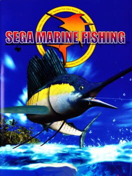
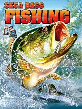
Unlike Sega Bass Fishing, which used Handel Gothic for the majority of UI Elements, here it literally only appears as the PRESS START BUTTON text. Still, good enough for me!
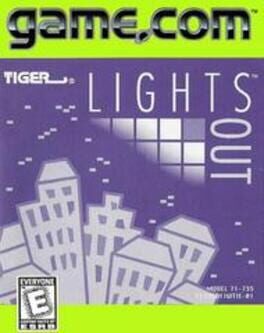
This entry is a stand in for the game.com as a whole, which used Handel Gothic for the handheld's logo
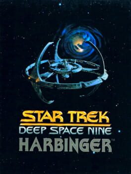
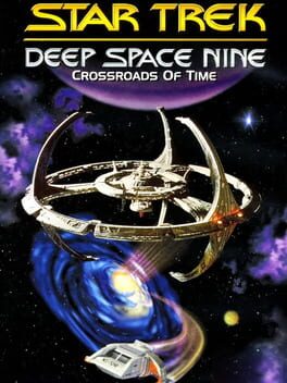
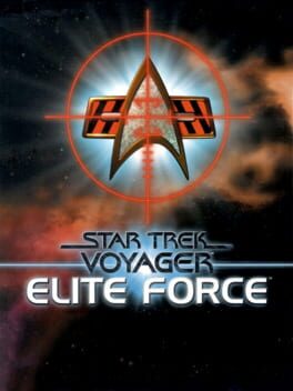
Used in the classic DS9 Opening Credit Roll
God Bless the artists who made a bitmap font of Handel Gothic for this games text and menus
This entry is standing in for the studio of Idea Factory as a whole, who has been using Handel Gothic for their logo since this, their very first game.
Thank you to the anonymous user on Cohost for pointing this one out.
https://staging.cohostcdn.org/attachment/75da72ce-8031-4717-be34-087a6397893a/chrome_2024-05-02_17-45-46.png
https://staging.cohostcdn.org/attachment/75da72ce-8031-4717-be34-087a6397893a/chrome_2024-05-02_17-45-46.png
did you know that Nvidia's logo uses handel gothic? now you do!
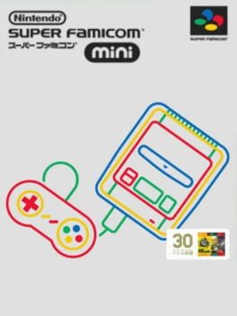
As mentioned in the Link to the Past entry, the Super Famicom logo uses Handel Gothic, with a combination of upper and lower case letters rendered as small caps.
Used for the Timer in the bottom right corner of the UI

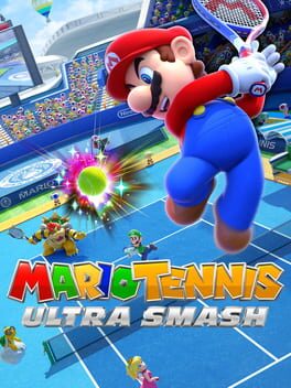
The in-universe logo for the "Mario Tennis Ultra Smash" tournament uses Handel Gothic
https://i.imgur.com/phHy8k8.png
https://i.imgur.com/phHy8k8.png
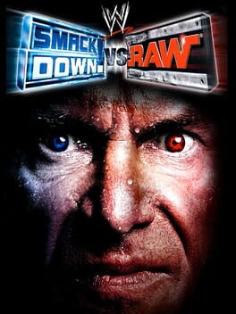
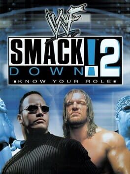
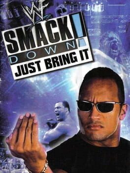
The lower thirds during wrestlers intros used Handel Gothic during WWF Smackdown broadcasts of this era, and therefore appears in the majority of Smackdown games released at the same time.
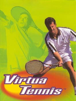
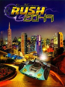
Used for the text that pops up in matches, "SET 1", "READY", "WINNER" etc.
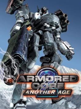
used for in-world signage.
https://i.imgur.com/JVD6zZE.png
https://i.imgur.com/JVD6zZE.png
The Narrow Escape text when you run away from combat.
https://imgur.com/NDGZzKt
https://imgur.com/NDGZzKt

FrogCass
9 months ago