games on here with shittier covers than they deserve
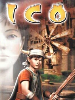
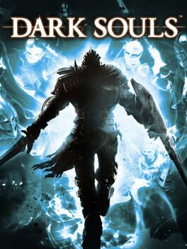
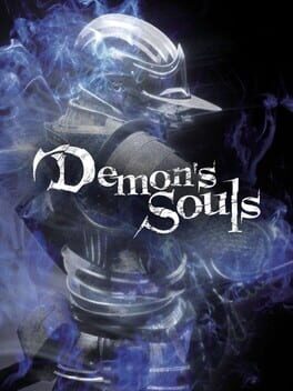
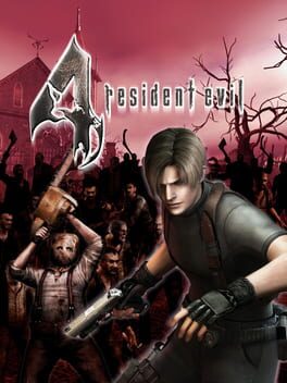
exhibit A for why IGDB sucks. doubtless there are endless more examples to give but these are the ones i've found. and because i'm not just a complainer, i'll link the covers that should be used for the games instead. hopefully backloggd will implement custom posters someday and this problem can be remedied.
23 Games
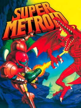

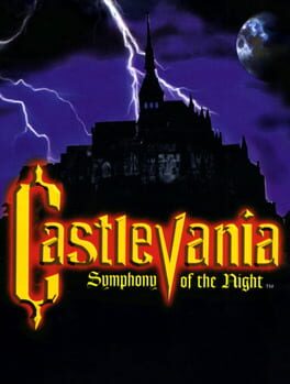
https://images.igdb.com/igdb/image/upload/t_original/co55ec.jpg (controversial, i know)
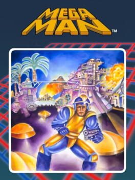
https://i.imgur.com/ZV6hvJd.png (there's probably a better version of this cover out there somewhere but whatever. also applies to most other classic mega man covers)

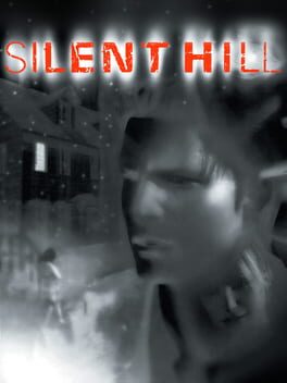
https://i.imgur.com/UyVBkPv.jpg (seriously fuck them for this lol. it's not even a north american cover, for some reason a scandanavian localization is more valid than the original release)
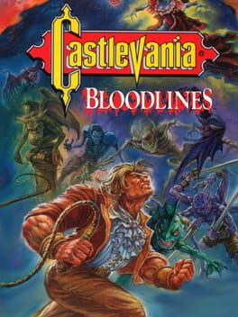
https://i.imgur.com/wTk84cI.png (current one isn't bad but it's identical to rondo's)
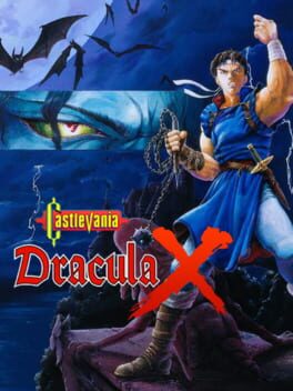
https://images.igdb.com/igdb/image/upload/t_original/co55x9.jpg (replace "the new generation" with "bloodlines" and it's golden. also john morris looks like jerma here)
https://i.imgur.com/rSk13y6.png (admittedly the current poster isn't terrible either)
https://i.imgur.com/HUafQBa.png (ditto, not a bad poster but this one is more fitting imo)
https://cdn2.steamgriddb.com/file/sgdb-cdn/thumb/0d6728955057895546f6b7c31404c138.jpg (suggested by consciovs)
https://cdn2.steamgriddb.com/file/sgdb-cdn/thumb/41c802b0b752604098aeec136963a9ab.jpg (suggested by consciovs)
6 Comments
This comment was deleted
I really liked this list, so I figured I'd comment to add a few that I've found:
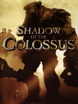
Shadow of the Colossus has a really cool cover that was never included with official art, but was used for a promotional DVD (here's a link to a version of it with the title added) https://cdn2.steamgriddb.com/file/sgdb-cdn/thumb/7eb34878362f67244415aaf134f35cbe.jpg
I like the original art used for Spelunky's Vita release better https://cdn2.steamgriddb.com/file/sgdb-cdn/thumb/713c78d5539e0350361c2d6c1abe36e8.jpg
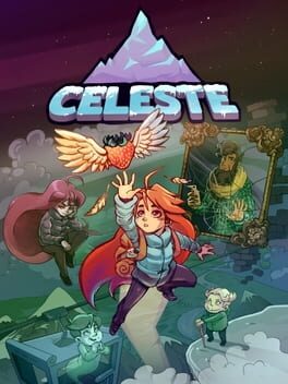
Artwork that was featured in Celeste's Piano Collection (although the original wasn't bad, I like this one more) (also linked to a version where the title was added) https://cdn2.steamgriddb.com/file/sgdb-cdn/thumb/0d6728955057895546f6b7c31404c138.jpg
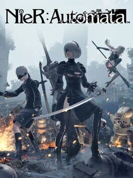
Nier Automata has some really cool artwork that's only used for 'The End of Yorha' edition of the game on Backloggd https://cdn2.steamgriddb.com/file/sgdb-cdn/thumb/41c802b0b752604098aeec136963a9ab.jpg
If you like them, feel free to add them
(edited twice for formatting, sorry for all the deleted comments)
Shadow of the Colossus has a really cool cover that was never included with official art, but was used for a promotional DVD (here's a link to a version of it with the title added) https://cdn2.steamgriddb.com/file/sgdb-cdn/thumb/7eb34878362f67244415aaf134f35cbe.jpg
I like the original art used for Spelunky's Vita release better https://cdn2.steamgriddb.com/file/sgdb-cdn/thumb/713c78d5539e0350361c2d6c1abe36e8.jpg
Artwork that was featured in Celeste's Piano Collection (although the original wasn't bad, I like this one more) (also linked to a version where the title was added) https://cdn2.steamgriddb.com/file/sgdb-cdn/thumb/0d6728955057895546f6b7c31404c138.jpg
Nier Automata has some really cool artwork that's only used for 'The End of Yorha' edition of the game on Backloggd https://cdn2.steamgriddb.com/file/sgdb-cdn/thumb/41c802b0b752604098aeec136963a9ab.jpg
If you like them, feel free to add them
(edited twice for formatting, sorry for all the deleted comments)
thanks, will add some of these. coulda sworn i had included that shadow of the colossus cover on the list already!
p.s. - i saw you in the comments of matthewmatosis' recent stream, along with some other backloggd moots. wasnt there for it when it was live, woulda said hello otherwise. always fun running into familiar ppl elsewhere online.
p.s. - i saw you in the comments of matthewmatosis' recent stream, along with some other backloggd moots. wasnt there for it when it was live, woulda said hello otherwise. always fun running into familiar ppl elsewhere online.
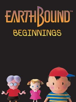
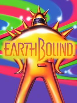
thank god there's another page for MOTHER itself on here for some reason, I refuse to use the EarthBound Beginnings page cuz of that box art lol (though i'm also just not a fan of how they renamed it). EarthBound tho I have to begrudgingly agree on despite being overall a lover of the localization's aesthetic choices, especially after IGDB made it worse a few months ago
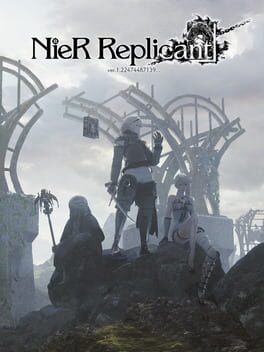
Nier Replicant ver.1.22 also has a box art they used in Japan that's in line with Automata's Japanese cover that I feel is a lot cooler than the one we got in the west https://cdn2.steamgriddb.com/file/sgdb-cdn/thumb/9dcecafda1dec7a08c0630b896ff82cc.jpg
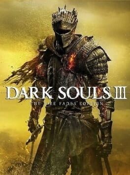
also Dark Souls III: The Fire Fades Edition's Japanese cover continuing the theme of "sleepy guys" from the Japanese demon's souls, dark souls, and dark souls II's covers after skipping it for base game of dark souls 3 https://cdn2.steamgriddb.com/file/sgdb-cdn/thumb/5fb1bcd667c399e04746564e1ca4dace.jpg
Nier Replicant ver.1.22 also has a box art they used in Japan that's in line with Automata's Japanese cover that I feel is a lot cooler than the one we got in the west https://cdn2.steamgriddb.com/file/sgdb-cdn/thumb/9dcecafda1dec7a08c0630b896ff82cc.jpg
also Dark Souls III: The Fire Fades Edition's Japanese cover continuing the theme of "sleepy guys" from the Japanese demon's souls, dark souls, and dark souls II's covers after skipping it for base game of dark souls 3 https://cdn2.steamgriddb.com/file/sgdb-cdn/thumb/5fb1bcd667c399e04746564e1ca4dace.jpg
yeah i think the mother page was added relatively recently - it's a pretty good compromise, but still aggravating that the earthbound beginnings page has sorta been cemented as the real one. if "different pages for each release" is what they're going for, i wish igdb was actually consistent in enforcing that, but it can't even manage that.
Consciovs
5 months ago