Favorite Box Arts
Idea inspired by Hot_Anarcocoa's "25 Cover Arts I Like".
I'll probably end up making this a ranked list at some point, but I want to publish it and don't have time to do so at this second. Note that I don't have an encyclopedic knowlede of every game's box art and some will have some emotional tie to me or whatnot, so this list is hardly comprehensive or trying to be objective. Also, good box art doesn't mean a good game, so it isn't like a game has to be good to get on here!
I'll probably end up making this a ranked list at some point, but I want to publish it and don't have time to do so at this second. Note that I don't have an encyclopedic knowlede of every game's box art and some will have some emotional tie to me or whatnot, so this list is hardly comprehensive or trying to be objective. Also, good box art doesn't mean a good game, so it isn't like a game has to be good to get on here!
72 Games
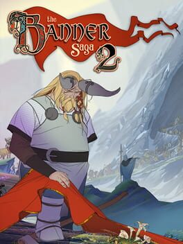
The quiet and sad reflection that clearly shines through this one makes it my favorite of the Banner Saga boxarts, although they're all at least good.
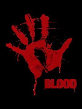
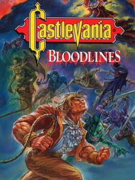
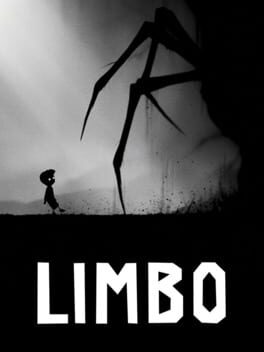
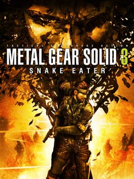
Raw as all hell. A bloody palmprint, a single title (and on the original box company names etc), and that's it. The rip in the middle of the palm into the totally black background helps add a good touch and it has a true "roughness" to it that keeps it from feeling merely generic.
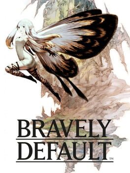
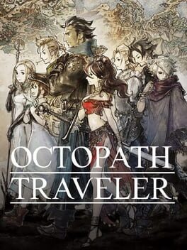
The Airy version. If you've played the game, you know a reason why having Airy dominate the cover is brilliant. Aside from that, the butterfly-fairy design combined with the very hand drawn look and way the black creeps on the wings + the BG is just very appealing to me.
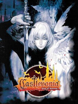
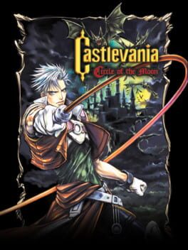
This is honestly one of the more basic Castlevania box arts but it always appealed to me a lot. Maybe because of that? Nathan's style feels different than the Belmonts and the pose is dynamic, so it somehow stands out despite being basic.
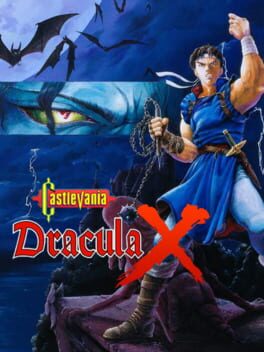
Vampire's Kiss is generally considered basically a worse Rondo of Blood but damn if this hyper stylized box art isn't unique in the entire Castlevania box cart canon.
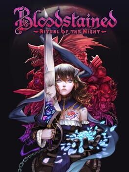
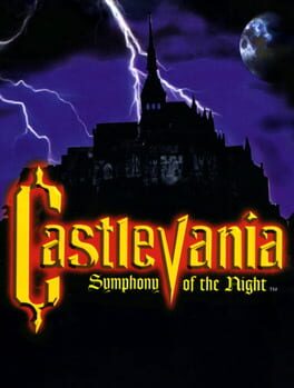
This is pretty much the perfect gothic, Castlevania-style cover art and the coloring is so on point too, the expression, bits of gold to go with it, certified banger.
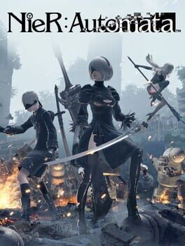
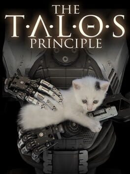
Pleeeeeeease let this game be good
To be specific, since this game has a few versions: https://www.mobygames.com/images/covers/l/292079-dust-an-elysian-tail-playstation-4-front-cover.jpg
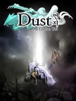
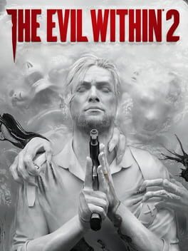
The totally chalk white visuals, almost like being covered in dust, looks slick as fuck. The way the hands grab at his shirt, blending into the background somewhat yet marked with splashes of black, is...my mind just wants to say "neat". And I like how it feels a bit ambiguous on if the gun is to shoot himself, or another purpose.
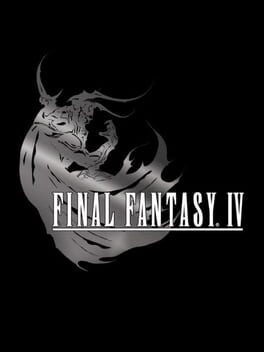
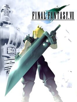
This is one of the sickest Final Fantasy logos and the contrast of a stark black background against the light grey Golbez is striking.
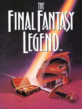
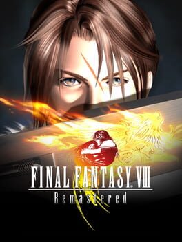
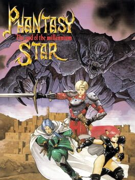
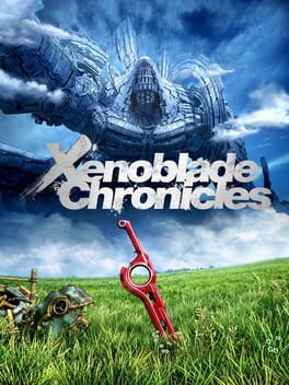
There's an art to simplicity and this is it. Looks like it'd be a D&D guidebook cover or something and perfectly encapsulates the "emotions" of an old school JRPG in my opinion. A perfect distillation into essential parts.
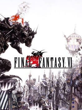
TBH this looking so expansive and gripping is a big reason I've always been interested in the game (I only ever saw this boxart and never it as FF3).
Link to said boxart as Backloggd has changed which one it is using: https://i.redd.it/ckjo4vst8ya21.jpg
Link to said boxart as Backloggd has changed which one it is using: https://i.redd.it/ckjo4vst8ya21.jpg
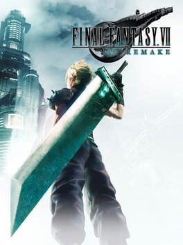
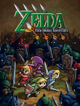
It not only recreates an iconic boxart, but it manages to do so while having it's own feel, very impressive.
Specifically the Japanese and European Version: https://upload.wikimedia.org/wikipedia/en/thumb/2/27/Final_Fantasy_XII_Box_Art.png/220px-Final_Fantasy_XII_Box_Art.png
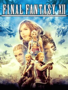
I think this looks pretty cool at a base, it gets a lot of memes due to the upside down Claude but frankly the memes just make it funnier and therefor more enjoyable.
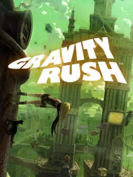
This game being on here twice isn't a mistake. Once for the PS4, all white background box art, and once for the original PS Vita art.
Personally, I love the all white one the best, even more than with the background. The pure white space makes it feel empty, which combined with Kat and Dusty's pose makes it feel like falling endlessly. I love it.
Personally, I love the all white one the best, even more than with the background. The pure white space makes it feel empty, which combined with Kat and Dusty's pose makes it feel like falling endlessly. I love it.
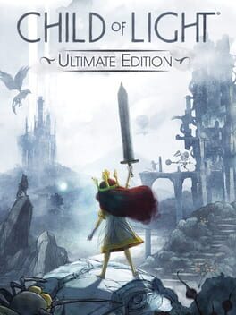
Everything about this art oozes aesthetic, to the point I feel like I get an idea of the game and want to buy it just looking at it. Maybe not as polished as others, but in a way that adds to the feelings?
This cover art makes me feel Transmetropolitan or Hunter S. Thompson and while I don't know if either of those are truly logical it does sure feel like it fits Hotline Miami's theme.
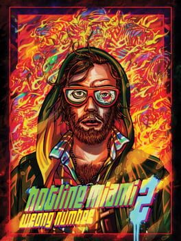
The bright, neon-noir garish colors and the setup of the cover basically vomits the game's aesthetic at you and I love it.
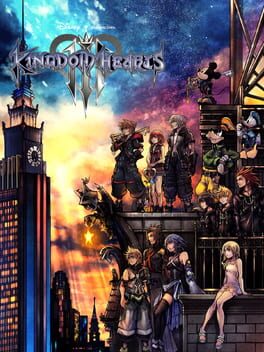
Basically box art perfection. I think something the first three games captured in their box art (and games) which later ones didn't was this somewhat forlorn sense, yearning, a bit nostalgic even? The last part especially fits with the Disney theming. Just look at Sora's expression, or how the characters look away from the dark city to the skies as if searching for something. The golden light of the moon against the dark city backdrop, IMO, only adds to this.
I like how Donald/Goofy are at the bottom. You're entirely liable to look at the name, then look down at all the JRPG style designs, then BAM it's Donald and Goofy, what the hell there's Disney in this? It's a bit subdued and in turn feels like the way to put them in the first game. Giving them the same style as the rest, as if it isn't out of the ordinary at all, also adds to the Kingdom Hearts appeal IMO.
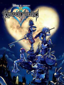
I like how Donald/Goofy are at the bottom. You're entirely liable to look at the name, then look down at all the JRPG style designs, then BAM it's Donald and Goofy, what the hell there's Disney in this? It's a bit subdued and in turn feels like the way to put them in the first game. Giving them the same style as the rest, as if it isn't out of the ordinary at all, also adds to the Kingdom Hearts appeal IMO.
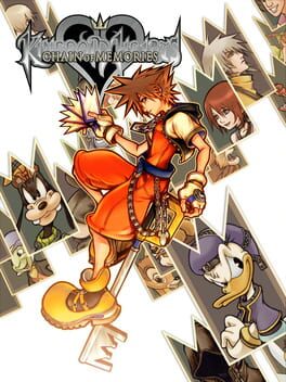
Feels like it fits the somewhat forlorn theme seen in early Kingdom Hearts art well, Sora alone in a swirl of his friends as memory cards is pretty killer, the fact Namine is fully drawn on the art yet the logo covers her up on the box itself is actually fuckin' brilliant.
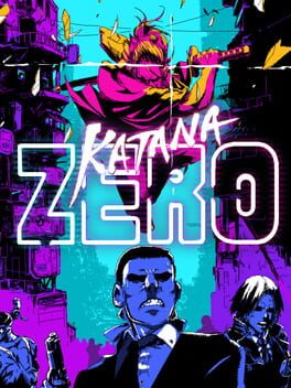
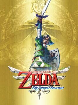
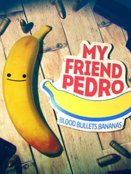
I don't really have anything deep to say about this I just think it looks cool and fits the game well.
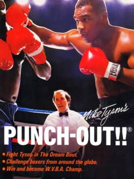
The fact it is just flatout Mike Tyson slugging a dude and not at all video game-y makes it actually feels really unique and it's iconic.
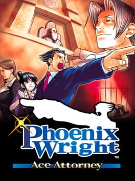
The dramatic shading around the judge, Edgeworth's oozing smugness from up high, Phoenix Wright doing the Objection pose. This is basically a perfect Phoenix Wright box art.
Not the US artwork, but instead the PAL box art: https://images-na.ssl-images-amazon.com/images/I/51IRPdlAbmL.jpg
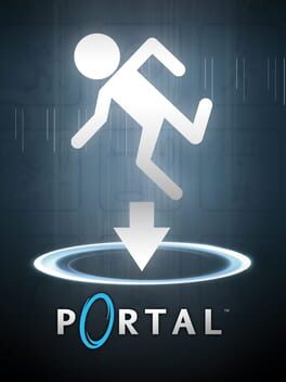
The fact they basically have one of those bathroom sign stick figures being flung into a portal, complete with directional arrow, feels like it fits right into Portal's humor. It also gets across the game's concept in a direct, yet fun way.
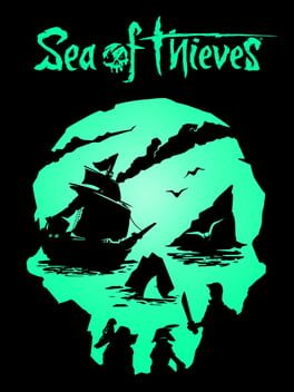
It's really unfortunate this game's fucking amazing box art is wasted on a game that by all accounts is mediocre. It's a skull with every single part of it organically represented by what you'd expect in a pirate game or at sea, that's so COOL and it slots together perfectly, not feeling forced.
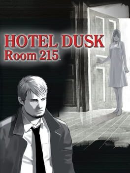
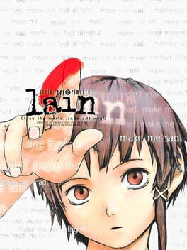
You can't look at this box art and tell me it doesn't inspire some interest into the mystery it presents. Having a single word pop out against the color of her hair vs. the words on the white background is an excellent choice.
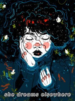
ngl I know nothing about this game but damn if that isn't some pretty cover art.
Backloggd cuts off Eggman's head and doesn't make it look as cool, here's full art: https://www.mobygames.com/images/covers/l/13116-sonic-the-hedgehog-2-genesis-front-cover.jpg
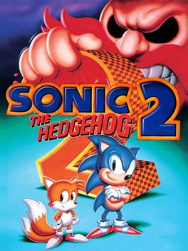
Honestly I just REALLY love the color choices here and how the blue "bleeds" into purple, aside from that the effect they use in the tree is pretty dang swanky.
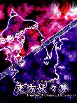
I just love the way the color split looks, and the way it is seperated by a border is a wonderful reference to Yukari's powers.
6 Comments
sees Drakengard 3 horny on main?
I actually totally forgot that you could add games to lists from their page, so I'll go do that now.
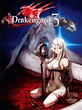
For Drakengard 3, I like the contrast between what would normally be considered a bit of a...submissive pose, I suppose? Something a bit more like that, maybe "mysterious" is better but I dunno the vibe I mean if you've seen that kinda pose you get it, with the obvious blood all over and sense of violence. The stark blood red also gives a lot of contrast with the pure white of Zero's outfit and Mikhail's coloring. It looks sick as hell, at least imo.
For Drakengard 3, I like the contrast between what would normally be considered a bit of a...submissive pose, I suppose? Something a bit more like that, maybe "mysterious" is better but I dunno the vibe I mean if you've seen that kinda pose you get it, with the obvious blood all over and sense of violence. The stark blood red also gives a lot of contrast with the pure white of Zero's outfit and Mikhail's coloring. It looks sick as hell, at least imo.
Maybe I'm a simpleton but I see that pose and that outfit and I think "horny anime girl" lmao
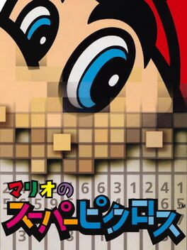
mario picross gives me nightmares
@Hot_Anarcocoa: Hey man not everyone has the same tastes / see things and also Zero is absolutely horny, so. (She's so good at the same time, tho...)
@Dwardman: Right? If you told me this was a horror box art I'd believe it. Mario's dissolving!
@Dwardman: Right? If you told me this was a horror box art I'd believe it. Mario's dissolving!
Hot_Anarcocoa
3 years ago